Inspired Idea: How to Transform Your Boring Mantle into a Vintage, Blush Pink Dream
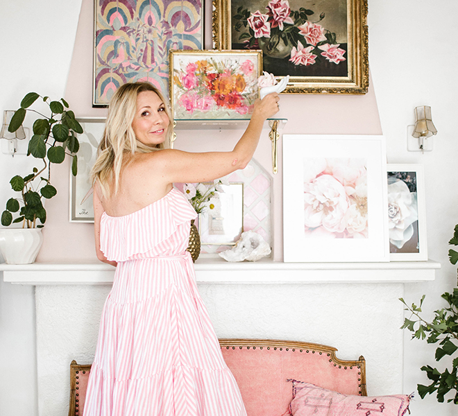
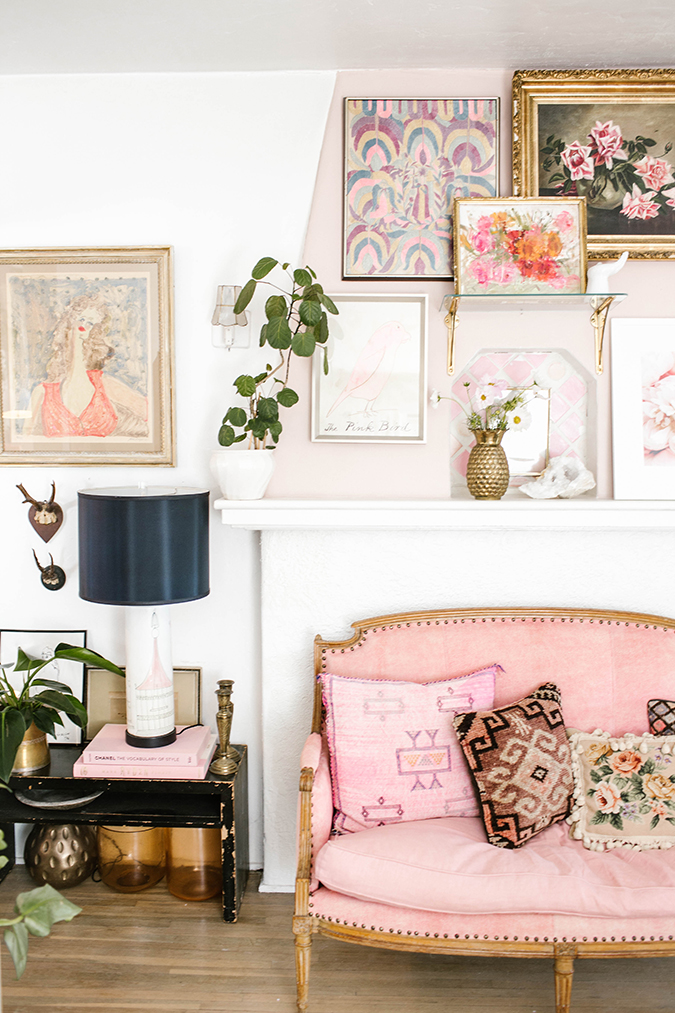
Hey everyone, it’s Kate Martindale here. Anyone who knows me knows that I’m not the type who decorates a space in my home and considers it “finished.” In fact, everything in my home is constantly changing, evolving, being added to, being embellished. I guess you can call that a dead giveaway characteristic of any prop stylist! Most recently, I found myself feeling über inspired to redo my mantle wall. You might remember seeing it at Christmastime here on LaurenConrad.com in this post, with its plain white walls and muted and vintage oil paintings. There was nothing wrong with my mantle, but as I was staring at it one day, I decided it was time for a makeover. Which brings me to today’s Inspired Idea. Take a peek at the before and after below, and keep reading for my tips on how to create a vintage-eclectic mantle (or even just an accent wall) in your own home…
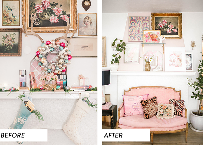
The Process:
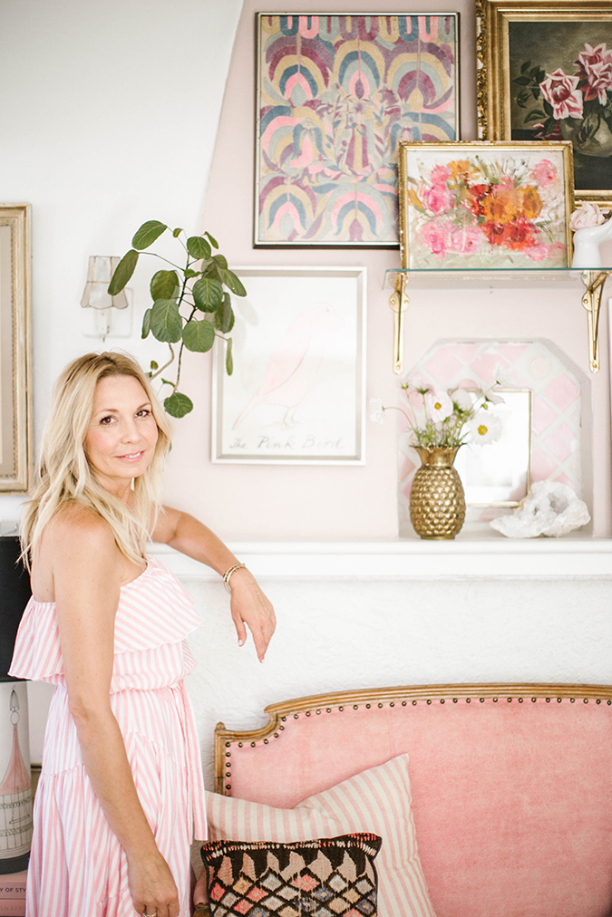
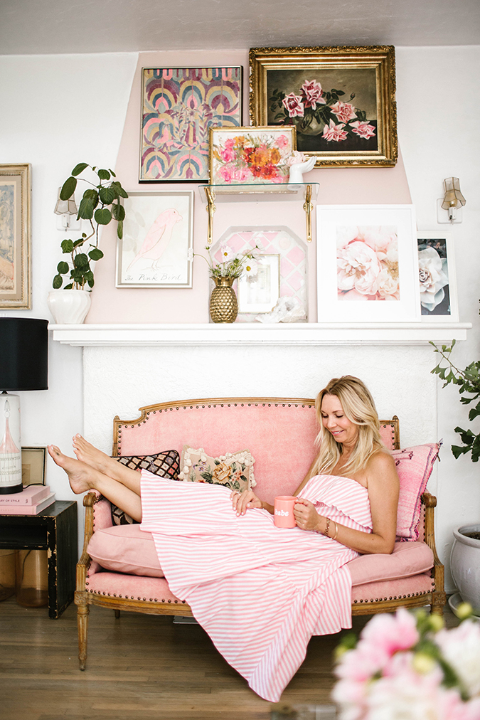
I wanted to take my vintage pictures down and modernize the space with some more modern paintings and photos. I also wanted to add a pop of color to the wall above the mantle. So, the first step I did was paint this wall the softest shade of blush pink. Years ago, I created a mosaic on the small middle ensconced area with vintage pink tiles from Chicago, and this little area is what inspired me to go full pink with the space.
I then added a brass and glass shelf in the middle of the mantle for a modern twist and to incorporate something three-dimensional.
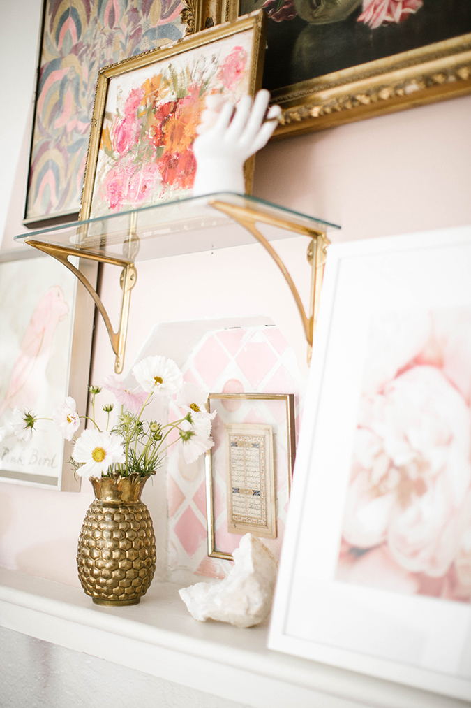
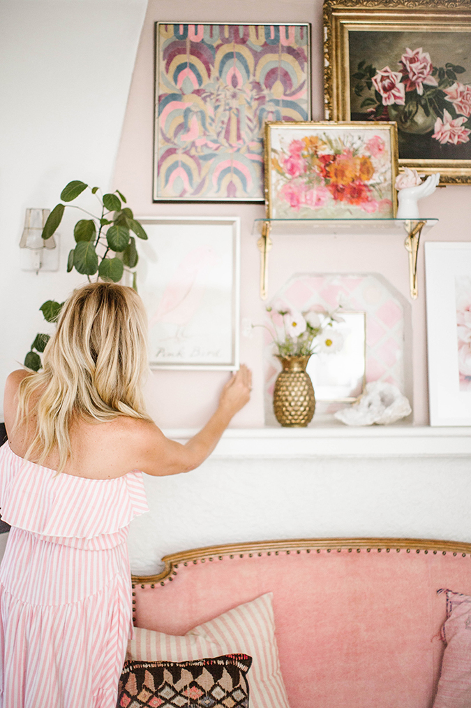
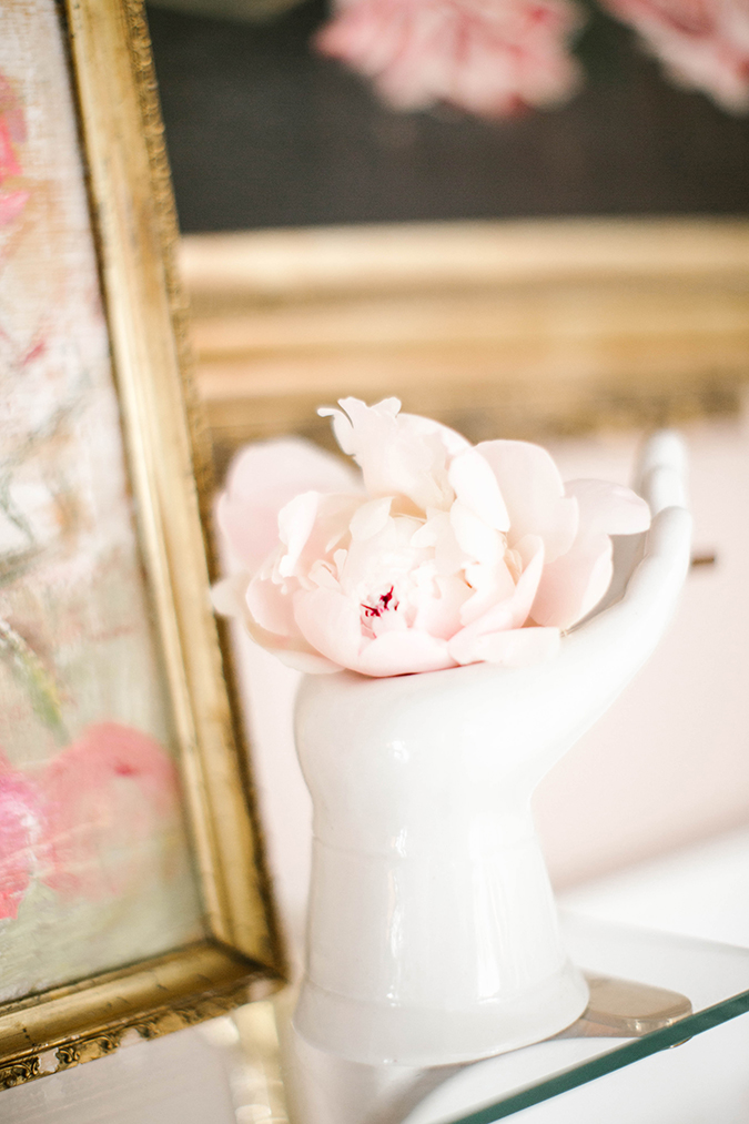
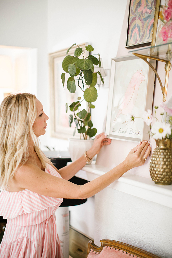
Lastly, I added the finishing pieces by hanging the art. I kept one of my vintage oil paintings from the previous mantle and added more modern pieces, like Amy Neunsinger’s flower photographs. I added a vase of fresh flowers, a houseplant, a funky antique hand sculpture from the 1960s, and framed the area by moving my favorite pink settee couch to sit right in front of the fireplace.
So now that you know my decorating process, here are some of my interior decorating tips for transforming an area of your house into an eclectic, monochromatic space…
Kate’s Tips for Creating an Eclectic, Monochromatic Space
1. Pick a color, any color…
If you’re looking to create a monochromatic space—say an accent wall with paintings and surrounding pieces of décor that fall within the same color scheme—you’ll want to pick one “hero hue” as I like to call it, and build on that color with similar shades. Whether it’s navy blue, all white or even neutrals, the way to achieve the monochromatic look is to make sure you have a little bit of something that breaks that up so that you create contrast and intrigue (a pop of orange against navy blue, a black lampshade against pale blush pink). And, don’t be afraid to mix hues within the same color. When done correctly, a pop of bubblegum pink in a space that is mostly blush can create a really cohesive look.
2. Add greenery.
I strongly believe in always adding plants to any space. I do this mostly for scale; to add height and dimension, and of course, life. Think of adding plants like an end table—it grounds the space and creates weight and balance. Greenery can even modernize your space if you pick a plant that is more modern and less traditional. The taller tree plant I placed on the right side of my mantle is called Maiden Hair Tree, and it’s really unusual and interesting, which makes the space a bit more modern.
3. Mix and match modern and vintage.
In case you couldn’t already tell, I love mixing modern and vintage pieces. In the photo above, I even incorporated a hand-sewn textile piece at the top left. If you have a piece of beautiful fabric, a textile or even cool scarf, you can always frame it to give your gallery wall a new layer of dimension. I’ve even framed pillowcases. Also, be sure to vary the colors and weights of the frames. White frames keep it looking modern, and the gold filigree frames make it more vintage, silver and brass frames will also add a modern touch, so don’t be afraid to mix these around a little. Same goes for the pots you have your plants in and the pillows you place on your couch. In my personal opinion, mixing vintage and modern makes everything more interesting, always!
4. Create a focal point
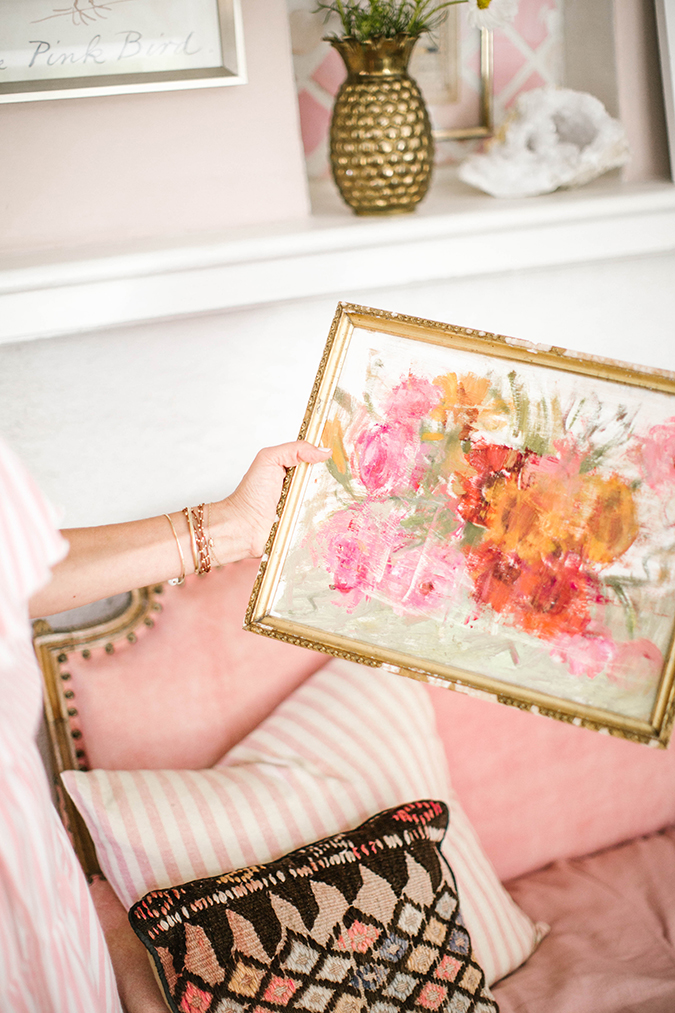
What I love about how my mantle turned out is that the particular painting above is brighter and creates a focal point. To me, a focal point is key because you don’t want your wall to look flat. You could layer artwork that is all the same tone and completely balanced… But that gets a little boring. My best piece of advice is to have a piece that pops.
I hope you enjoyed a peek into how I totally transformed my fireplace mantle! Stay tuned for more interior decorating posts coming from yours truly soon.
Do you have any decorating tips to add to my list?
Xx Kate
Photos: Jessi Burrone for LaurenConrad.com
